Thursday, 15 December 2011

Magazine cover development

For our magazine cover we decided to take influence from the 'Little white lies' magazine covers. 
We found that their covers consisted of one main character who had been edited or drawn to look like a cartoon. As our cover would need to have both Antar and Cindy on it as they star equally in our trailer. We decided that instead of using the 'Little white lies' cover, we would create something very similar, but change the name and some stylistic features (e.g having two main characters on the cover rather than one, changing font styles and sizes) 
We thought this was a good idea as it allowed us to have more freedom. It also gave us the advantage of changing the name of the magazine to 'young film' as it relates to a younger audience which is intended for our trailer. 
To make our cover cartoon like we took pictures of Antar and Cindy and then edited the whole picture and colours on photoshop creating distinguished shadow lines and features. The video below shows the pain staking task of changing colours and features by selecting small sections at a time and changing them. On the right is an example of cindy before being edited on photoshop and after.


On the background of our magazine we decided to create synergy between the movie trailer, poster and magazine by repeating faint 'rec.' moving in the same direction across the background. This is relevant as the trailer is about video diaries.
For the name of our magazine 'young film' we decided to have a caption underneath , as it is an independent movie magazine we created an acronym for the caption. The acronym is of the word film and the caption says 'fun and independent little movies'.
For the positioning of antar and cindy we decided to have them next to each but facing away from each other as the movie trailer is about how they originally don't on with each other. To express how they become friends throughout the trailer we made the expressions on their faces happy and content.
The magazine in general with its cartoon images is very creative and therefor gives us a good reason for it to be displaying an independent film on the cover.


Friday, 9 December 2011

Poster development.

We have taken some pictures and got a feel for the lighting as we want the subject of the photo to be clearly visible and the picture to be of a good standard. We felt that some of our images were too dark and editing them would effect the quality of the images. The result of this was that we retook the photos and managed to get the two effective character shots. The photo shoot gave us the idea to have 'Chase' leaning on the title of our movie. Not only would this be attractive to the eye, but it would also give a feel for his character. Furthermore having 'Cindy' slightly slanted against the 'V' of our title works really well too. 


As a group we had to look for the official font used for posters so we had to search on the internet and find it and then add it to our project, we also had a problem using the exact same font as the font used in our trailer as this was an edited font on the program live type so it was not easy to replicate so we had to find a font similar to this font this worked quite well but we as a group know that we should have picked a font to remain complete synergy throughout or film.


After much drama, we came to the decision creating a heart out of images was not going to work. The result we were hoping to get was not up to our expectations so we decided to scrap this idea. Instead, we decided to use the text with the two main characters as our main statement across our poster. In doing so we decided to make our poster landscape. Along with this we decided to use a film strip across the top of our  poster which would show the development of the characters' relationship. 


Our final idea was to make our poster more interesting and display our theme of love by using the outline of small red hearts on our background. This fitted in with the theme of our poster and presented the originality we were aiming to illustrate. The hearts also hint on what is to come in the film.

Wednesday, 7 December 2011

Poster influences for 'Valentines Diary'

As our movie is a romantic comedy we decided to research in to how these movies were incorporated in their poster. We became aware of the characteristics of these movie posters quite quickly. The posters usually were based on a white background which reflected the innocence of the movie. We found that using a white background would be the most suitable for our trailer and that the use of this would mean that emphasis was placed upon the characters and the titles rather than any special effects.


Film posters we felt influenced our initial ideas were ones such '500 days of summer'. We found their film poster influential to our poster as the style of it fits the romantic comedy genre, along with an indie influence to it. We found that the idea of using multiple layered photos was a good idea, and thought that using this effect would be effective on our poster if we took shots of 'Chase' & 'Cindy' together. From observing this film poster it is clear to see that there is characterisation with the use of the male located on the bottom right drawing. We felt that using the main characters in our movie individually with a prop that enhances their character and allows audiences to get a taste of what is to come. 

Other fim posters that influenced our design was '50 first dates', we thought that the use of polaroid images could work as it was personal and we felt we could show the development of 'Chase' & 'Cindy's' relationship in this way. Instead of taking this idea straight it gave us the idea to create a heart out of mini polaroid images. We felt this would be creative and an individual way of providing audiences with a taste of what is to come. As our idea developed we were inspired by this to create a film strip portraying the two characters as individuals and romantically.


Change of idea for The Chase

After reviewing our idea on 'the chase' scene we have decided the shots we already had of Antar chasing Cindy could work. Our reason being if we took multiple short cuts of the pre-exsisting footage we would be able to create an effective final clip for the trailer. The short cuts would vary from our previous shots and would create the correct atmosphere for the scene.


It become apparent when testing this theory that the idea worked. The short takes put together which we had already shot fitted together creating a successful sequence.We were happy with the outcome and decided that this would be perfect to use in out trailer. The atmosphere is unnerving for the audience and ends with a cliffhanger which portrays the idea there is something to come. 


Wednesday, 30 November 2011

our initial idea for a poster

This our poster idea the heart is made of specific moments we wanted to show as things in our story which show the characters bonding. the middle of the heart will have a picture of the two holding hands this shows the two will finally come together. The title of the film valentines diary will be the colour red as this is used for most romantic films released on valentines day. The slogan lights camera attraction relates very well to our film in the sense it incorporates exactly what our film is about. The poster will have to images of both characters either side very distant from each other this is where we wanted to show the characters opposition to each other.

We had some problems with this and decided we would use the idea of the two character still but the heart would not fit and look as good as we originally thought

Saturday, 19 November 2011

Catch-up; Problems we have encountered and other information.

We have been spending most of our time filming and editing our trailer. We have come up with obstacles during filming and editing which we've had to deal with.


- One of our first issues was after filming the 'locker room' scene and editing it we realised it would look better with a close up on cindy or chase's face. We decided to make the close up of chase and went to film it the next day. What we didnt realise is that the lightbulbs in the locker room had been replaced consequently making the shot a lot brighter meaning the continuity between the shots were off.
To overcome this , we changed the close up to one of cindy's reaction because she isnt actually standing in the locker room. We found this worked and during editing managed to match cindy's close up of her face and her slamming the door back to the medium distance shot of her closing the door which looks very effective.


- Another problem we encountered was our storyboard. We were unable to do the scene where Cindy and Chase give each other tasks such as joining the school band and starting cheerleading. This was because couldn't find a cheerleading costume and the shot was too similar to previous shots that we have. Not having this shot meant our storyboard no longer made sense. There wasn't evidence for how Chase and Cindy suddenly went from two people who didn't like each other to them falling in love. As we were going through our many different shots of Chase and Cindy together we came up with the idea of having a short montage starting of with them being distant with each other to them having fun and playing around. We also had a shot of Cindy and Chase sitting down and chase slowly takes his hand out of his pocket and slides it over to take hold of Cindy's hand. What we did was split this clip into three parts and interalced it in the montage ending with them holding hands. This looked very effective. Of course montage's are usually scene in horror and action films but can also be in romantic movies. To make sure we didnt give of the wrong effect we had to make sure our clips weren't too short but also not so long that they took up a vast amount of the trailer time. We decided to make each clip about a second and a half long which we thought gave a very good effect to the trailer.


- There were also some problems with the editing , this was because we had an idea of having home video's by Chase and Cindy throughout the trailer. To make this clearer we wanted to add an effect to the shots by overlaying an image of the typical "REC" sign and framing so that you can clearly see it is a home video diary. Mr Go found the image we needed and we tried it out on his MacBook which worked perfectly , but when moving the image of to the Mac that our clips are on , we found that it didn't work on that specific computer. To overcome this we have decided that we won't overlay the image until our trailer is finished. Once it is finished we'll export it into quicktime and transfer it to the MacBook and edit it in. Because our trailer is yet to be completely perfected we haven't been able to do this yet but we are positive that this is the solution to our problem.


We have started making our title cards , after experimenting with colours and effects we decided to go for a plain white background with red/burgundy writing. The effect we chose for the words make it look like it is being sketched onto the white background which is perfect for our trailer as its all about home video diaries and school projects. We had to come up with what to put on the title cards and in what places we were going to use them to split up clips. Our trailer starts with a clip of Chase's video diary and then Cindy's video diary. We decided to keep it simple and put "one boy... " before chase's and "one girl" before Cindy's as this is what our film is about ; one boy and one girl falling in love. we also need to come up with a cliche line and we went with "do opposites really attract?" . we liked this as it relates to our film which is about two opposites coming together. Our last title card says "how will it end?" this is because our last shot is Chase chasing after Cindy. We feel it leaves the audience wanting to find out how it ends and challenges them to go watch the film.

Thursday, 10 November 2011

Things we still need to film:

  • Shots with cindy
  •  Antar chases Cindy down school lane, this is filmed with close ups and handheld, and will switch to a different shot to show dynamics. This is when Antar enters the shot. 
  •  Cindy outside school by poles. Has a conversation with Chloe, this is filmed with an over the shoulder shot to show variety of shots. 
  • Cindy & Antar walking down the corridor happy and pushing eachother about, but when stranger approaches they distance themselves. 
  • Shot of the two very close on a bench, but a long shot to show its just them in the area (isolation) 
  •  shot of the two holding hands, then they let go when someone looks. Include a close up of the hands. 
  • classroom shot empty desk and Antar introducing his video diary.

Tuesday, 1 November 2011

logo development.

so we were thinking about how we were going to do our logo with the hat which says 'A.N.C' and the hand next to it saying 'productions'. Antar was saying that he didn't think that the word 'production' would fit well on the hand and suggested changing it to a piece of card next to the hat instead and animating it. we decided to try out the original idea first , even though the hat hasn't arrived yet. 

We then realised that the word comes out backwards as you can see above. With surprisingly little difficulty we wrote the word productions on backwards and decided to picture it again. 

 
Although we managed to solve the problem of the words being backwards we then had to think about the distancing from the camera and making the words bolder.  So here is what it looks like closer. 


We decided this looked good but we really needed the hat to put the whole image into perspective. so we are we going to wait for the hat to arrive and then experiment more. 

Change of 'Preppy' to 'Chav'.

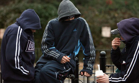
After much of a debate we as a group have come to the decision to change our preppy character 'chase' in to what one would call a 'chav'. Our decision was based upon the idea which was brought to our attention by Antar of whom would be playing the character. He pointed out how it was rare for a preppy teenager to be present in an English school as this type of stereotype is comonly portrayed in American films as the cliche character.


We discussed what would need to be changed and what effects the change would have on our planning. It is apparent that the only change that would need to be made would be the actor's voice and appearance. The storyline would appear the same and little change would need to be made. Now we must look in to the traits of a 'chav' and how we can encorporate this in to our work. Our approach is aiming to be naturalistic and not stereotypical in order to create realism within our work rather than completely unrealistic.

Saturday, 22 October 2011

Song Choice

While in lesson today we had an assitant teacher , while explaining to him our idea he pointed out that he had heard the term 'Indie Cindy' before , which made me remember where i'd got the inspiration from . which is a song by hadouken consisting of these lyrics

Hadouken! - That Boy That Girl lyrics

That girls an Indie Cindy, 
Lego haircut and polka-dot dress, 
I don't care if she thinks she's indie, 
how she's different is anyones guess


These gave us a great idea for our teaser trailer as there is a point where the character 'Chase' Is singing onstage , at first we were undecided on what to have him singing , but now we have decided these few lines above would be perfect for this section.

We also considered a track similar to this for the backing track for our actual trailer as we are undecided yet on what we are using. 

Although this doesnt emphasis the sad moment in the trailer its very upbeat and modern which goes well with the attributes of our trailer. As these songs are all made through technical programs on the computer it would be quite simple for us to make something similar or make a cover of one of them.

Research in to Independent Production Logos.


As our teaser trailer is going to be for an independent film we decided to look more into independent film company logo's as research to give us more reasoning behind our logo. We came to find that a lot of them are quite simple, yet effective which we feel is exactly what our logo idea is aiming to be.
We have decided to use a mixture of technology and photgraphy to create our logo giving us an interesting range of techniques which is much more creative. We like the idea of using graphical letters in order to encorporate the 'Productions' part of our logo rather than writing the word on our hand like we originally planned. In order to do this our aim is to use a blank piece of card being held by the person wearing the hat stating 'ANC'.


Casting Interviews

Going back to our previous post about changing characters we thought we should divulge more information about how we decided on our choice of actors.
We decided to be quite professional about it and choose a few people to interview for casting.


For the casting of Cindy we interviewed:
- Cindy Wellings
- Emily Porritt
- Vivienne Smith.


First of all we got told them what the film was about and about the character of 'Cindy'. Then we asked them to read a few lines from the script in the way they felt was appropriate. Cindy Wellings and Emily Porritt both delivered the lines appropriately and how we imagined them to be said. Unfortunately , we felt Vivienne's voice was too soft for the character of 'Cindy' as we felt she would be a more independent and strong girl.
To decide between CIndy and Emily we took into consideration appearance and how well they could conform to the typical indie style. We liked the fact that Emily is quite petite but she is a natural blonde whereas we always imagined 'Cindy' as a brunette. We also feel Wellings would suit the indie attire more than Emily would. This is how we came to the conclusion of having Cindy Wellings playing the female lead.


For the casting of Chase we intervied;
- Antar Adams
- Tom Merritt
- Zac Houili


We used the same casting process for the boys , We felt Antar and Zac both had good execution of the lines but Tom sounded too common as we imagined Chase as being well brought up and quite posh. Then we analysed Antar and Zac to see who fitted the role better appearance wise. We decided that Zac ctually looked too much like an Indie kid and that Antar seemed more opposite to Cindy. We felt Antar would suit the preppy look better so decided to choose him to play "chase".