Wednesday, 30 November 2011

our initial idea for a poster

This our poster idea the heart is made of specific moments we wanted to show as things in our story which show the characters bonding. the middle of the heart will have a picture of the two holding hands this shows the two will finally come together. The title of the film valentines diary will be the colour red as this is used for most romantic films released on valentines day. The slogan lights camera attraction relates very well to our film in the sense it incorporates exactly what our film is about. The poster will have to images of both characters either side very distant from each other this is where we wanted to show the characters opposition to each other.

We had some problems with this and decided we would use the idea of the two character still but the heart would not fit and look as good as we originally thought

Saturday, 19 November 2011

Catch-up; Problems we have encountered and other information.

We have been spending most of our time filming and editing our trailer. We have come up with obstacles during filming and editing which we've had to deal with.


- One of our first issues was after filming the 'locker room' scene and editing it we realised it would look better with a close up on cindy or chase's face. We decided to make the close up of chase and went to film it the next day. What we didnt realise is that the lightbulbs in the locker room had been replaced consequently making the shot a lot brighter meaning the continuity between the shots were off.
To overcome this , we changed the close up to one of cindy's reaction because she isnt actually standing in the locker room. We found this worked and during editing managed to match cindy's close up of her face and her slamming the door back to the medium distance shot of her closing the door which looks very effective.


- Another problem we encountered was our storyboard. We were unable to do the scene where Cindy and Chase give each other tasks such as joining the school band and starting cheerleading. This was because couldn't find a cheerleading costume and the shot was too similar to previous shots that we have. Not having this shot meant our storyboard no longer made sense. There wasn't evidence for how Chase and Cindy suddenly went from two people who didn't like each other to them falling in love. As we were going through our many different shots of Chase and Cindy together we came up with the idea of having a short montage starting of with them being distant with each other to them having fun and playing around. We also had a shot of Cindy and Chase sitting down and chase slowly takes his hand out of his pocket and slides it over to take hold of Cindy's hand. What we did was split this clip into three parts and interalced it in the montage ending with them holding hands. This looked very effective. Of course montage's are usually scene in horror and action films but can also be in romantic movies. To make sure we didnt give of the wrong effect we had to make sure our clips weren't too short but also not so long that they took up a vast amount of the trailer time. We decided to make each clip about a second and a half long which we thought gave a very good effect to the trailer.


- There were also some problems with the editing , this was because we had an idea of having home video's by Chase and Cindy throughout the trailer. To make this clearer we wanted to add an effect to the shots by overlaying an image of the typical "REC" sign and framing so that you can clearly see it is a home video diary. Mr Go found the image we needed and we tried it out on his MacBook which worked perfectly , but when moving the image of to the Mac that our clips are on , we found that it didn't work on that specific computer. To overcome this we have decided that we won't overlay the image until our trailer is finished. Once it is finished we'll export it into quicktime and transfer it to the MacBook and edit it in. Because our trailer is yet to be completely perfected we haven't been able to do this yet but we are positive that this is the solution to our problem.


We have started making our title cards , after experimenting with colours and effects we decided to go for a plain white background with red/burgundy writing. The effect we chose for the words make it look like it is being sketched onto the white background which is perfect for our trailer as its all about home video diaries and school projects. We had to come up with what to put on the title cards and in what places we were going to use them to split up clips. Our trailer starts with a clip of Chase's video diary and then Cindy's video diary. We decided to keep it simple and put "one boy... " before chase's and "one girl" before Cindy's as this is what our film is about ; one boy and one girl falling in love. we also need to come up with a cliche line and we went with "do opposites really attract?" . we liked this as it relates to our film which is about two opposites coming together. Our last title card says "how will it end?" this is because our last shot is Chase chasing after Cindy. We feel it leaves the audience wanting to find out how it ends and challenges them to go watch the film.

Thursday, 10 November 2011

Things we still need to film:

  • Shots with cindy
  •  Antar chases Cindy down school lane, this is filmed with close ups and handheld, and will switch to a different shot to show dynamics. This is when Antar enters the shot. 
  •  Cindy outside school by poles. Has a conversation with Chloe, this is filmed with an over the shoulder shot to show variety of shots. 
  • Cindy & Antar walking down the corridor happy and pushing eachother about, but when stranger approaches they distance themselves. 
  • Shot of the two very close on a bench, but a long shot to show its just them in the area (isolation) 
  •  shot of the two holding hands, then they let go when someone looks. Include a close up of the hands. 
  • classroom shot empty desk and Antar introducing his video diary.

Tuesday, 1 November 2011

logo development.

so we were thinking about how we were going to do our logo with the hat which says 'A.N.C' and the hand next to it saying 'productions'. Antar was saying that he didn't think that the word 'production' would fit well on the hand and suggested changing it to a piece of card next to the hat instead and animating it. we decided to try out the original idea first , even though the hat hasn't arrived yet. 

We then realised that the word comes out backwards as you can see above. With surprisingly little difficulty we wrote the word productions on backwards and decided to picture it again. 

 
Although we managed to solve the problem of the words being backwards we then had to think about the distancing from the camera and making the words bolder.  So here is what it looks like closer. 


We decided this looked good but we really needed the hat to put the whole image into perspective. so we are we going to wait for the hat to arrive and then experiment more. 

Change of 'Preppy' to 'Chav'.

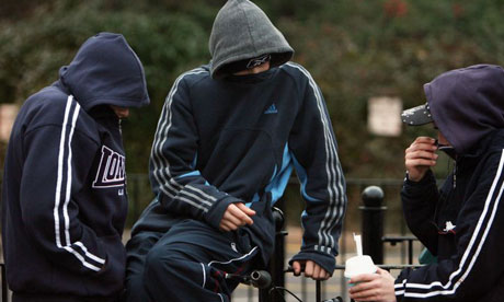
After much of a debate we as a group have come to the decision to change our preppy character 'chase' in to what one would call a 'chav'. Our decision was based upon the idea which was brought to our attention by Antar of whom would be playing the character. He pointed out how it was rare for a preppy teenager to be present in an English school as this type of stereotype is comonly portrayed in American films as the cliche character.


We discussed what would need to be changed and what effects the change would have on our planning. It is apparent that the only change that would need to be made would be the actor's voice and appearance. The storyline would appear the same and little change would need to be made. Now we must look in to the traits of a 'chav' and how we can encorporate this in to our work. Our approach is aiming to be naturalistic and not stereotypical in order to create realism within our work rather than completely unrealistic.